
To Lindisfarne and Back
An unlikely dialogue

Regular readers may have noticed that The Pathos of Things has some new visual trimmings. Logos, favicons, and email banners are not artworks that reward deep reflection – at least, mine are not – but they do provide an excuse to discuss some sources of inspiration.
I’ve long complained that digital culture is aesthetically impoverished because it encourages everyone to adopt a uniform, “user friendly” minimalism. Visual elements and layouts have to be easily digestible to eyes trawling large volumes of content, and doing so on a tiny smartphone screen. The obvious answer is to go for something bold and simple, a formula that can look pleasingly “classic” in any case. When everyone does this, we end up with an environment that is hyper-stimulating in sensory terms, but artistically rather drab and utilitarian. We are deprived of that kind of beauty that arises not from simplicity, but from the harmonious arrangement of complexity.
I suspected that I couldn’t entirely escape the minimalist logic of the Internet. That would require considerable skill, and I’m no graphic designer. But maybe I could pull in a different direction? So I chose a starting point about as far from the digital era as one can imagine: a book created 1,300 years ago, on a tidal island off the coast of Northumbria, northeast England.
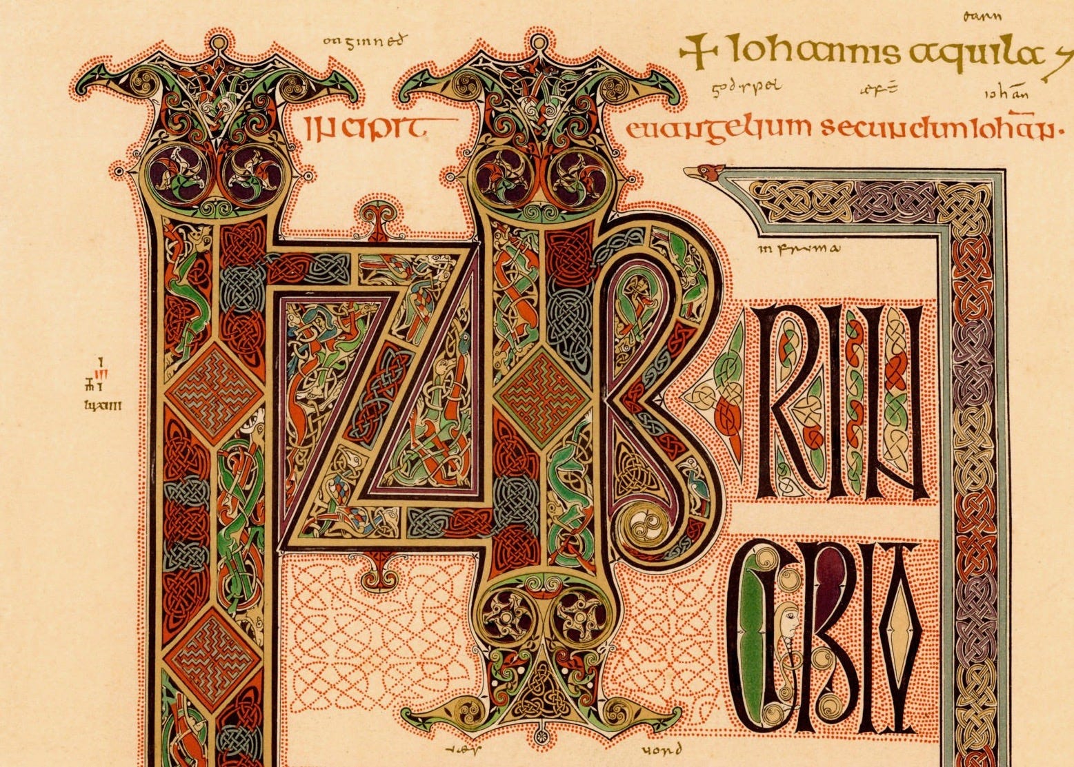
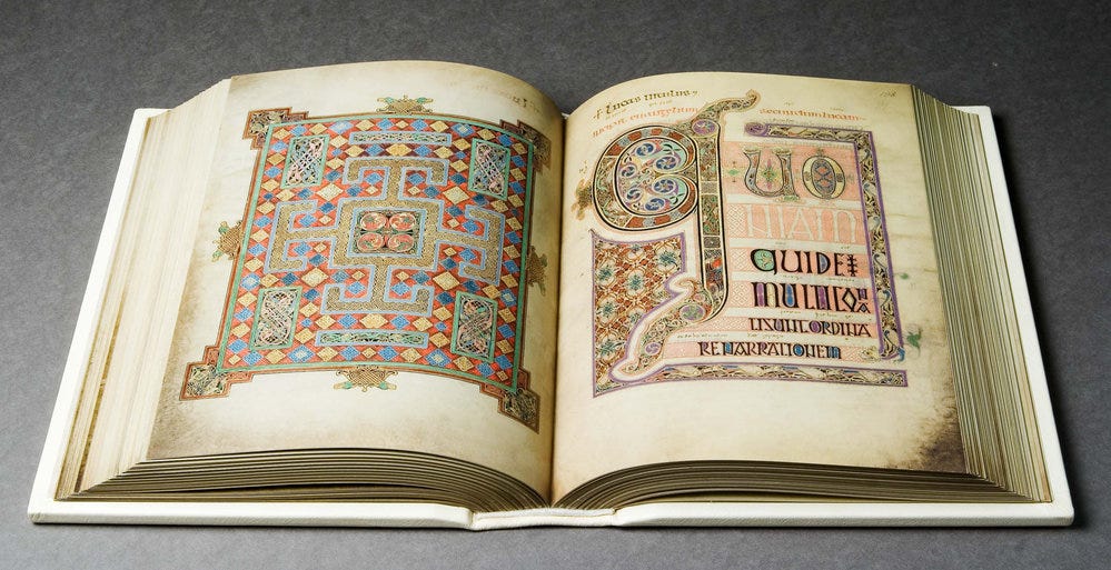
That island is Lindisfarne, most famous as the site of a monastery that was brutally pillaged by Vikings in 793AD. A few generations earlier, a bishop called Eadfrith had made the book now known as the Lindisfarne Gospels. It is a strange, mesmerising, extraordinarily beautiful artefact; an early example of the lavishly decorated (or “illuminated”) manuscripts that would become treasures of medieval art. It comes from a world in which books were revered not just for their religious significance, but because they were extremely rare and difficult to produce, requiring years of patient labour in the scriptoria of monasteries.
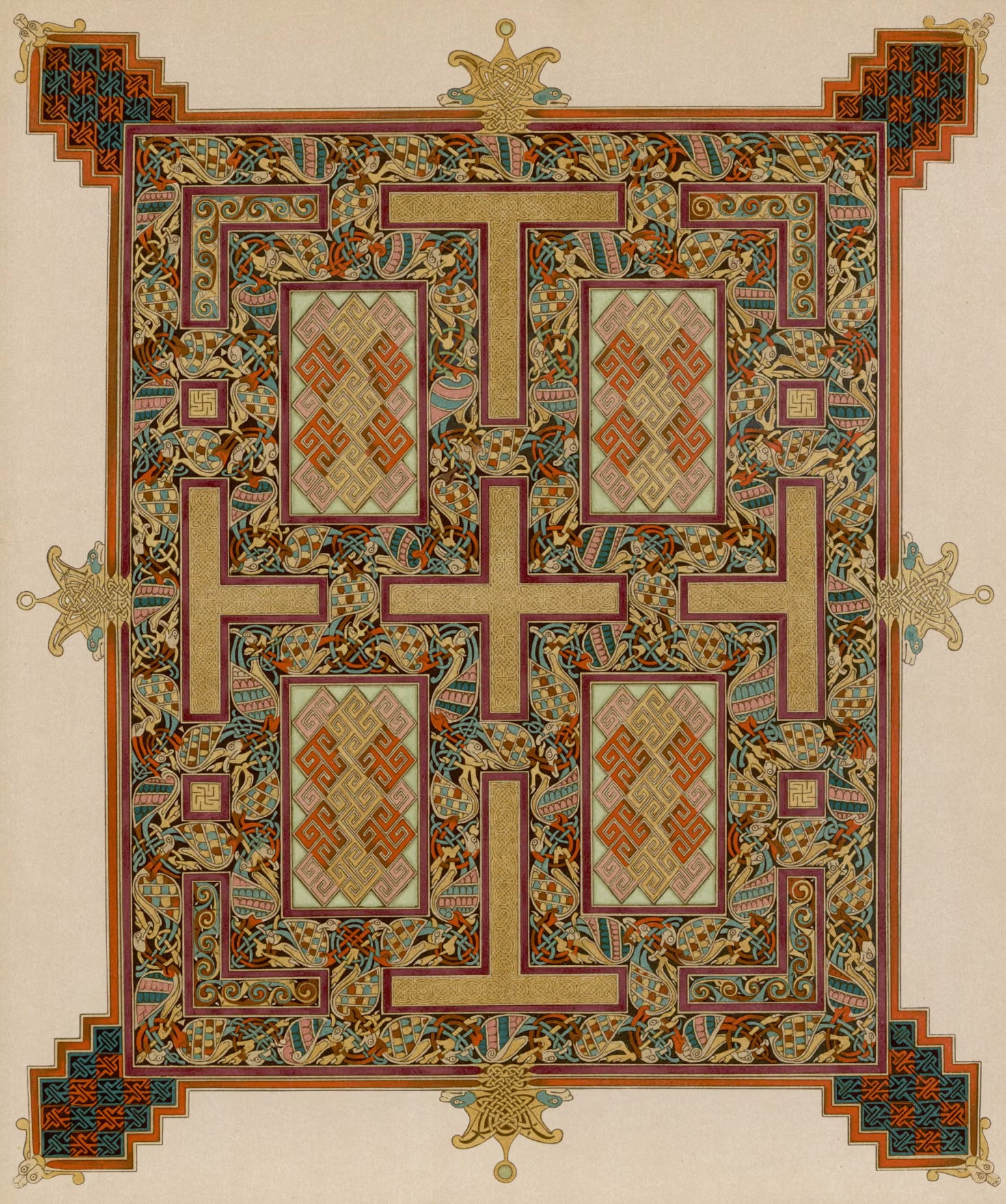
Eadfrith reportedly worked for a decade on the Lindisfarne Gospels, which is actually quite brisk when one considers the endless prayer and toil demanded by monastic life, not mention his responsibilities as a prominent bishop. One hundred and fifty calfskins supply the book’s pages, a considerable investment. He managed to create dozens of exquisite colours using, for the most part, a handful of local pigment materials. Clearly he wasn’t lacking in purpose. For such artists, says former British Library curator Dr Michelle Brown, “the act of making [was] a symbolic sacrifice on behalf of all human kind and all creation.” Should not that be the spirit in which we compose every Substack post?
Joking aside, we share greater affinities with the people that made and treasured illuminated manuscripts than one might think. Our visual experience has become so flat, standardised, and mediated that we can well appreciate the aura which surrounded rare works of manual skill and physical beauty. Besides, as I argued in a recent essay on the future of reading, declining literacy may mean that, before long, the culture of books will again belong to a small, dedicated minority.
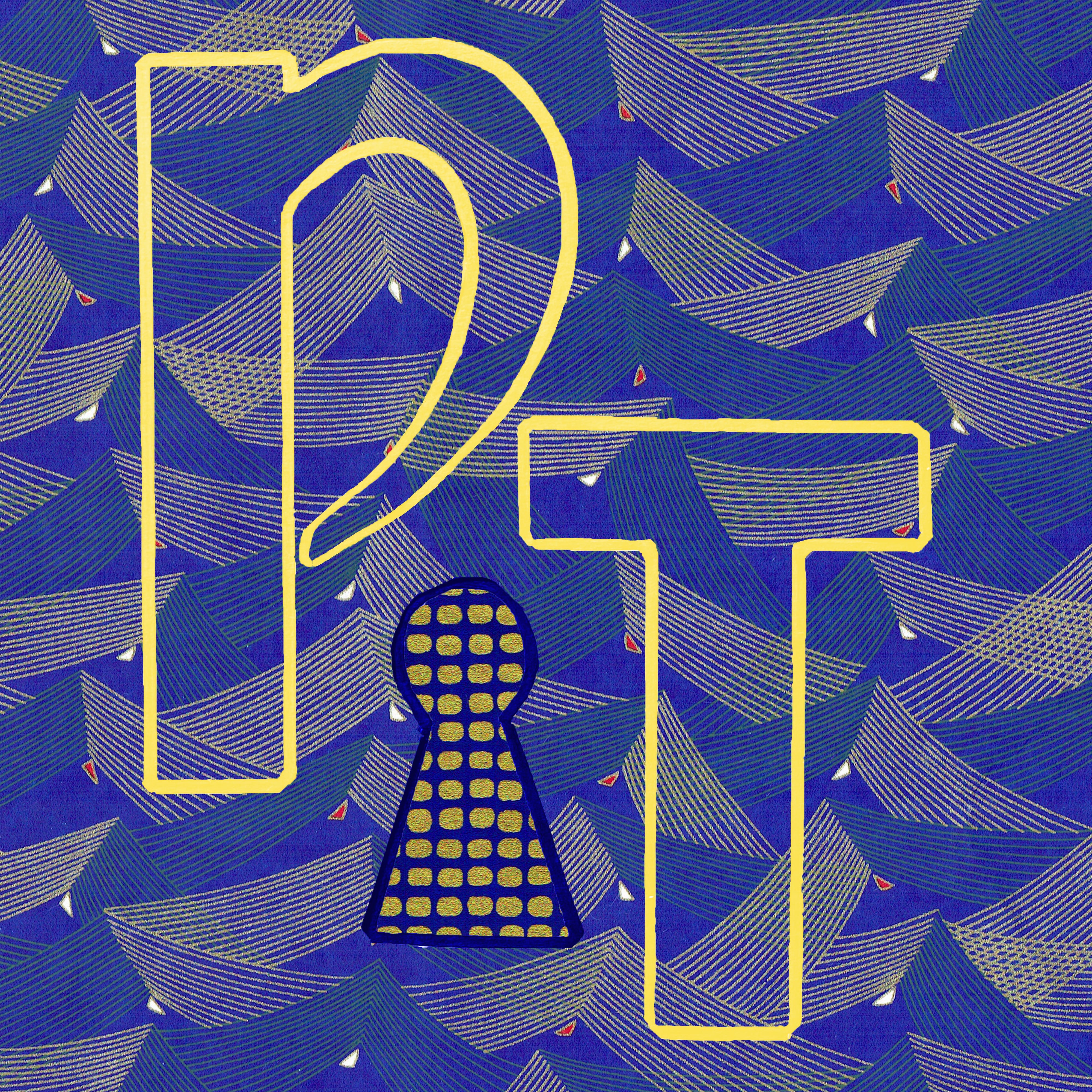
Anyway, I chose a few pages from Eadfrith’s book and tried to come up with some kind of contemporary interpretation. It didn’t quite take me a decade of work, though it did involve some trial and error and doing things by hand. Starting with reasonably complex designs, I gradually simplified them while trying not to lapse into default minimalism. A solution of sorts was to incorporate patterned papers from Shepherds, a wonderful bookbinding store in Victoria, London. I used drawing and collage because I find such things satisfying, and because they ensured a degree of imperfection that seemed appropriate for the DIY ethos of Substack.
The keyhole motif emerged more or less spontaneously, though I think it has some nice resonances in the context of writing as a means of exploration and a quest for understanding.
What a treasure, what an extraordinary artifact the Lindisfarne Gospels are! What perfection of detail, what complexity and harmony! I remember an exhibition of Persian carpets, once seen – the same immense and painstaking toil, the same rich imagination, the same perfect combination of lines and colors! The religion of beauty is certainly one that can unite us, no matter how different we are.
Fascinating work here (the manuscript and your own approach to rebelling against flat, internet minimalism).